Friday, 16 December 2011

LIGHTING CONSIDERATIONS FOR HORROR FILMS


The key light is the main source of light on the source.
The fill light is the light that fills in the shadows.
The backlight is the light that fills in the background lighting.


make up


These are a couple of images to use as inspiration for our horror film make up. These images are taken from a slasher film, we are also making a slasher film so this will help us when we come to doing the makeup. 

Me and Jake will need to get a few items to be able to make our characters look like how we want them to. We will need to get:
A clown mask, pale makeup, fake blood, tattered shorts and tattered and torn clothes for Izzy.

I think that we have chosen the correct actors for our film. Our male actor, Matt, is the correct physique as he is tall which will create a sense of power, this is critical for a threat in a slasher film. Our female actor, Izzy, who will be acting as the poor mother, is also the correct physique as she is quite skinny and short which could make it more believable that she is poor and unable to look after her baby. Having a seemingly weak victim is also key in a slasher film.

Friday, 9 December 2011

MOVING PICTURES (STORYBOARDING) THE SIXTH SENSE


The purpose of storyboarding is so that we can show the audience what shot we would like to show at certain points during our horror film and also what's in the shots (characters, background, etc.). Storyboarding is pretty much planning what shots we're going to use and what we're going to include in each shot throughout the film.

How can you show lighting/camera angles and camera movement in your storyboards?
If you plan to use some camera movement at a certain point then the best thing to do to show this in a storyboard is to draw it out image by image. For example if your starting point of the camera movement is where you're looking straight at the character then your next few images could be where we begin to see the side of the character. As for camera angles and lighting they're much simpler. For camera angles you just have to draw the image in the way you plan to shoot the image when filming. Finally for lighting you can just shade in certain parts of the images to show where you plan the light to come from.

Nightmare on Elm Street script example


This is the script from Nightmare on Elm Street, it shows us how we can write a script without using a lot of dialogue.

Script Examples


This is an example of a script layout.

Friday, 2 December 2011

Notes on Kyle Cooper

Kyle Cooper
Kyle Cooper creates fantastic title sequences, he enjoys using handmade things such as breaking glass, because they have a sense of imperfection about them. He also likes to study cells, skin, teeth and bones. This gives us new ideas as to what to put into our horror film title sequences.
Kyle Cooper title design - Part 1
Kyle Cooper title design - Part 2

Comments on our pitch


These are comments from our class on what they think of our idea. It has been suggested that we use a different location and not to use certain props. We were also warned about the logistics, e.g age etc.
We have been told that our general idea of the baby being brought up and turned into the killer is fine but the locations need to be believable.

Notes on True Blood

Opening credits of True Blood

Scary animals and death are everywhere in this opening, so we would assume that these things play an important role in the entire film. The churches we see show us that something unholy is going on, and the fangs suggest vampires. Another good part of this opening is when we suddenly see a child licking his lips which are covered in blood which we would assume thats what a vampire would almost look like once it's taken it's victim.

Notes on Seven

Opening credits to Seven

This film has a very dark and creepy opening. Reason why the opening is so good is because you do not see the threats face, this leaves a sense of mystery and when we see the threat pealing away at his fingers.  We can tell that he's doing this to make sure no one can find out who the threat is and they can't track him.

Sunday, 20 November 2011

Richard-textual analysis-A nightmare on Elm street

We only see parts of the threat at the beginning as we only see a pair of hands creating a weapon. This engages the audience as we want to know what the threat looks like. The victim is shown in a long and empty hallway. This shows that she cam be easily seen by us, and possibly the threat.
When we see the threat creating the weapon, it is very dark. There are also alot of objects in the room and on the table where he is making it, this creates alot of shadows. This creates a sense of mystery to the threat. When the victim is shown, it is very bright, this also suggests that the victim can be easily seen.
At the very beginning we can hear the threat banging together pieces of metal to make his weapon, and when the victim appears we hear a strong gust of wind. Both of these elements bring a sense of mystery to the opening.
The setting in which the threat is creating his weapon appears to be a small dark room filled with scrap metal and tools. This creates a sense of danger which then creates a sense of fear.The victim is in an empty hallway which shows that she is vulnerable and can be attacked at any moment.
The camera focus' our attention to the weapon that the threat is creating. This is done to create a sense of fear and anticipation as we want to know how and why he is making it and how and why he will use it.
A threat with a blade-based weapon, a group of teenagers in an empty house and a foolish blonde girl are all conventions of a slasher film, and they can all be found in the film 'A nightmare on Elm street'.
I think that the scariest part of this film is when the girl is being killed in her sleep. The chase scene within the nightmare really puts you into the nightmare with her. The dark lighting, use of fake blood and screaming adds up to create a terrifying scene altogether.

Friday, 18 November 2011

HALLOWEEN

Intentions for our film

I (Jake) last week watched the horror film Halloween and Richard watched A Nightmare on Elm Street. Both of these horror films are slasher films and in both of them there is a powerful killer who can't be stopped and they both where some sort of mask. In Halloween the killer wears a type of clown mask and in Nightmare on Elm Street the killer wears a mask that makes his face look scarred.

Both of these killers are males who look like they are middle-age men. In the opening to our film we would like our killer character to be a male teenager. In the opening to our film, we want a female actor to be cradling a baby crying, in the corner of a room. We then want to see her placing the baby somewhere in a wooded area with a clown mask and wrapped in some shorts. And then, in the future (when the baby has grown into a teenager) we would like to have the victim (the mother) being stalked through the woods by the stealthy killer who wants revenge on his mother for leaving him in the woods. For our costumes, we want our killer to be wearing a clown mask and tattered and torn shorts. Also, we want the female actor to be wearing scruffy clothes to suggest that she is poor, therefore she cannot look after the child.

At the very beggining of the opening, we want it to be set in a shack or some sort of abbandoned home, and then we want it to be mostly set in the woods. Throughout the opening sequence we want the lighting to be fairly dark.

Horror Wordle

This is a horror wordle that I (Jake) created on a horror film that I watched last week, Halloween.
this is a wordle of the description of the horror film that I watched, A nightmare on elm street.

Friday, 4 November 2011

http://www.youtube.com/watch?v=Qz341nWtW1Q

Slasher mindmap


This is our mind-map showing what we think are some of the typical conventions included in a slasher film. We have done this because we have decided that we would like to do a slasher film for our final project and this mind-map will help give us an idea of what to include in our film so that our audience will be able to identify what type of film they're watching.

final coursework group

Me (Richard) and Jake are still in the same group to make our final coursework video. We will be creating a slasher film of our own.

Thursday, 3 November 2011

Richards evaluation

Our finished video shows that we can hold a shot steady, as we used the tripod. We can also frame a shot properly, for example there was always enough head room. We used a variety of shot types, but we could have used more in some parts if the film. The composition techniques were just copied from the original film, I think that we did this quite well.

Our film shows that we can apply the rules of continuity editing.We had trouble with this in the past, but with some practice we have improved on this alot. Although the continuity is not perfect, for example Jake skips a few steps whilst he is walking up the stairs.

Our film has appropriate costume, make up and props as it was a slasher. So we used dark clothes for the killer, the props were a knife and fake blood. We came to the decision that we should film our 40 seconds at my house as it has a similar layout to the house in the original film. We chose the actors positions based on who we thought would be best at each role.

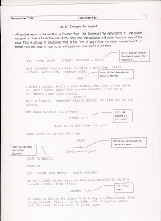
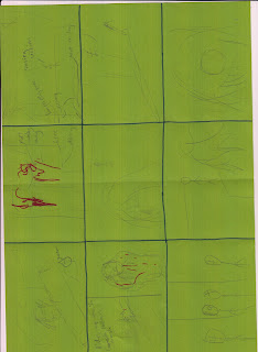
To help plan out the making of our 40 seconds, I drew the storyboard whilst talking to Jake about ideas. I also took some photos of my house, as did Jake so that we could decide where we should film our 40 seconds. I then wrote a shotlist, and the uploaded the storyboard, photos and shotlist onto our blog. During the filming of our 40 seconds, I positioned the camera and filmed most of our film. I also acted as the murderer in the film. I provided a place to shoot the film, the costume to the boy who was acting as the dead person in the film and the props such as the knife and fake blood. I applied the fake blood to the clothes to achieve the same effect in the original film. During the editing porcess, I helped trim the film down, get rid of parts that we did not need, and I helped put the finished pieces together so that the continuity was correct. I then uploaded the finished video to our blog.

The improvements that could be made are the lighting, as some parts if the film were too dark, and the viewer cannot see what is happening. We could have also improved the script, as our actors did not say exactly the same thing that the actors in the original film did. The continuity could have been made better during the actual filming. We could have done this by filming the same shots from different angles. When it comes to filming our final coursework film, I will plan it better by writing and drawing more onto the storyboard, I will also plan costume and props better and more in advance to filming. I will also try to improve on continuity during filming and editing, and improve on using lighting. I will also try to find better actors to act in this film and a script will be newly written  instead of copied from another film. I will also try to find a better location to shoot the film.

Friday, 28 October 2011

Jake - Individual Evaluation

Looking back at mine and Richard's 40 second re-make of last year's slasher film there are a number of good and bad points that came up with our filming and our final editing. Firstly we are very pleased that with the whole of our filming we managed to keep a steady shot to allow the viewer to see what's going on very clearly. We are also pleased with how well we framed each shot because what we tried to do was that we tried to use the same shot selections and shot types in our film and we managed to do that. However we did miss out two shots that were included in last year's film which we forgot about. When we finished editing our 40 second film we could clearly see that we applied the rules of continuity because of how well each of our shots flowed together. We made sure that with our filming we got the correct camera angles in order to apply the rules of continuity. As we were filming we kept looking back at each shot that we had to do in our 40 second film and we then compared how similar the shots were. Looking back we do think that we used the right people to help us in our filming. Me and Richard struggled to find people to help us so Richard and I both did the recording and the acting while our friend Lewis played the character who was found dead in the bath. We also think that the props we used were also very good even though there weren't that many props used in last year's film. All we had to include was a phone which the victim carried most of the time, a knife which the killer held covered in fake blood and when we enter 'Jessica's room' there were close up shots of some toys on her bed. These were very easy to include in our filming and they were each shown rather clearly at the correct moments. However the main problem that Richard and I faced was lighting. When we did our filming it became very dark and that is clearly shown in our final film because most of our shots were so dark you could hardly see what was going on but it still made sense because you could still quite make out what was happening in each shot. But we also think that the location we used (Richard's house) was very good because I certainly thought that there was plenty of room for our filming. In our film I played the victim, Richard played the killer and Lewis played the dead guy in the bath. I also helped with the filming by setting up the camera at some points and Richard did most of the planning by selecting the 40 seconds of the film that we were going to re-create. Improvements that we would make to our final film would be to use a location with more light where it's not that dark, and with some of our shots we didn't use the whole screen. For example when I first walk into the bathroom there's quite a lot of space above my head and in the final shot where we see Lewis in the bath, you see him at the bottom of the screen. So the improvements to be made here would be to not have so much un-used space in our film so that you can see each character in full detail. What we are planning to do differently is that we might use an outdoor setting for our film not an indoor setting.

Friday, 21 October 2011


These images show the recee sheets for Jake and Richard. On our recee sheets they show an arial sketch diagram of Jake's house and Richard's house so that it gives you an idea of what our houses look like and what areas of our houses we will use for filming.

Storyboard and Shotlist


These are the scanned-in images of our storyboard and shotlist for the original slasher film the we will attempt to re-create.

This is our 40 second re-creation of the original slasher film. There were quite a few mistakes that we made throughout our 40 second re-creation. Two mistakes we made straight away was that we missed out two short shots that were used in the original. The two shots were of a light bulb turned off and and a close up of Jake's hand trying to turn on the light switch. Also we think that our film didn't run quite smoothly even after we finished editing. For a few of the scenes it seemed like Jake jumped from one place to another. The best example of this is when Jake is walking up the stairs. He begins walking up the stairs from an over the shoulder shot but then the next shot is when the camera is looking down on him coming up the stairs and it looks like he's just skipped one or two steps. But our main problem was lighting. For the first few scenes the lighting was fine and you could see everything pretty clear but then the last few scenes were too dark and you couldn't really make out was happening. But looking at the original the lighting and the scenes look pretty similar to ours with lighting and what happened in each shot.

Thursday, 20 October 2011

Richards House


These are photos of Richards house, (hallway, living room, dining room and stairs in order), We think that this house will be better to film our 40 seconds in as the layout of the house is similar to the original video.

Tuesday, 18 October 2011

Pictures of Jake's house


These four images are of my house (Jake's house). These four images show the four main areas that were used in last years slasher horror film. If our group decides to use my house as the backdrop for our horror film then this is what the viewer will mainly see when watching our film. The first image is the livving room where the film would start from. The second image is from the top of the stairs where the victim would walk up. The third image is the bathroom where the victim meets the killer and where the film ends. The final image is the hallway where we would see the victim trying to turn on the light switch.

Patrick. - Storyboard and Shotlist.


These particular pieces of work are my Storyboard and Shotlist in which plan the appropriate things i need to o assure when i proceed in creating my 30 second film which is based on a students previous horror film.


These two images are our test pictures to show what our killing character might look like. In the first image we see Richard just normal whereas in the second image he looks dark and scary as if he was a killer.

Friday, 14 October 2011


This film we did is another re-take of our last piece of film for composition. We did this because we were told that our first piece of film for our composition was too basic because it was all shot from one angle. So with this new piece of film we did we shot the film from all different angles which made it look even better and make more sense. the editing went great along with the filming so it ran very smoothly again with no errors.

Composition


This filming sequence is probably the best our group has done so far. We still had to do some re-takes but not as many as we did with our other filming sequences. It ran really smoothly with no camera errors so every scene we did came out correct. However when it came to editing the film we decided to delete some of the scenes we filmed because we thought that they weren't that good and they didn't make much sense. Also between the first 2 scenes it seems that Richard kind of jumps from one place to another but other than that we are happy with how this film came out.

continutity exercise


We have finished editing our next continutity exercise. We had a few problems with our filming process and when we imported the film. One of the main problems that we had when filming the sequence was that we kept on making a couple of mistakes which meant we had to film the same scene more than once until we got it right. Then when we imported the film there was an error which then cut most of our filming making 2 of our scenes very glitchy and one of the scenes shorter than what we filmed. Other than these problems the rest of our film once we finished editing was that it ran very smoothly and made raesonable sense of what was happening.

Friday, 7 October 2011

First Continuity Exercise


Within today's media session, we had to re-create a scenario in which a character is walking along a corridor and then goes through a door, he then walks up to a friend and they both say hello to each other.  One character then asks for the time- the character then leaves realizing he is late. The good thing about our short movie is that, it is easy to follow the narrative, and it ran rather smoothly and had less continuity errors than our first video. The bad thing was that we had a bad camera interference which effected a lot of our recording, especially with the close-up shots of the watch, and the point of view shoot from behind Richard which made the scenes look shorter than they actually were, this caused two of the scenes to be ''jumpy'' and you couldn't really see much of what was happening. 

Friday, 30 September 2011

Within todays media lesson, we had to re-create a few shots from a sheet of paper, we had to re-in act the shots as if to say it was our own little short movie. Our video did not go quite according to plan...The reason for this is because our shots were to swift, they went so fast that it was too complex to understand. Another error was that the camera was slightly slanted, so some of the shots were of a canted angle. To the next error we see Richard running up the stairs in a fast motion, and we see that in one scene he ends landing on his right foot, and at the start of the next scene he lands on his right foot again, this is a continuity error. Also when we see Richard at the door, he ''magically'' seems to have teleported through the door and is casually looking at his watch. Our movie could have been improved in many a ways, specifically the timing, it was too fast-paced and hard to understand, it was all jumpy, and should of been correctly created..but it was not. However this is only our second time at using a camera, and bearing in mind i didn't even know the functions of the camera but in the end we kind of got there. 

Tuesday, 27 September 2011

Within the duration of todays lesson, we had our very first lesson on camera work. Through the process of this we looked at the diffent types of camera angles and shots, learned how to frame specific shots correctly and alter the cameras many functions, and also adjust the tripod in specific ways to get shots that we intended to accomplish eg; high shots, and low shots. Differentiating between some of the shots we worked on were as follows; Long shot, which allowed to see the environment behind an individual, these shots also help us to tell more about the person, where they are what they look like etc. Mid shot which allows us to focus more on the character, all the while not excluding the background, Close up shots, which allow us to mainly focus on the characters face, exceedingly benificial when wanting to show a characters emotion, extreme close up which allows us to focus mainly on a certain object or part of a person, this shot is exceptional when used with a blur effect, e.g; say if a character had a knife, you could extremely be close up to the knife and blur out the background to emphasise the knife's play in a film, giving the knife ''character''. Another shot we took was called well i cant actually remember the name, but i can describe it differently as a dutch tilt, this is where the camera is purposely tilted to one side so the horizon is on an angle. This creates an interesting and dramatic effect. examples of this shot can be seen in Orson Welles' Citizen Kane and the Batman series. All of the camera shots mentioned above can be found in this video, created by myself, Georgia and Lindsey.

Friday, 23 September 2011

First Blog 01

our group consists of Myself; Patrick Wood. Jake Burton and Richard Chubbock. Over these next few weeks, we will be using camera's and software to recreate a horror film previously made by fellow bilborough media students. We will be duplicating their ideas, for example we as a group have chosen to re-inact their slasher movie, in which involves a girl getting stabbed by a man in black inside a homely environment. Throughout this project we will re-creat their short horror film as best we can.